You’re not imagining it: when a gallery wall feels “off,” it’s almost always the spacing.
The visual impact is immediate: spacing controls whether the wall feels calm, curated, or chaotic.
There isn’t just one rule: different spacings create different energies—from editorial to eclectic.
This guide gives clarity: once you see the logic, the wall aligns itself.
Scroll on. Each section reveals a visual rebalancing—without telling you what to do.
Gallery Wall Spacing Rules create visual calm instantly
Spacing is not a technical detail.
It’s the invisible grid your eye uses to breathe.
When frames sit at the right distance from one another, the wall reads as one composition, not a collection of objects. Too close, and the wall compresses. Too far apart, and the story breaks.
The right spacing does three things at once:
- It connects frames without merging them
- It organizes visual weight across the wall
- It slows the eye, making the space feel intentional
This is why two gallery walls with the same frames can feel radically different. The difference is not taste. It’s spacing logic.
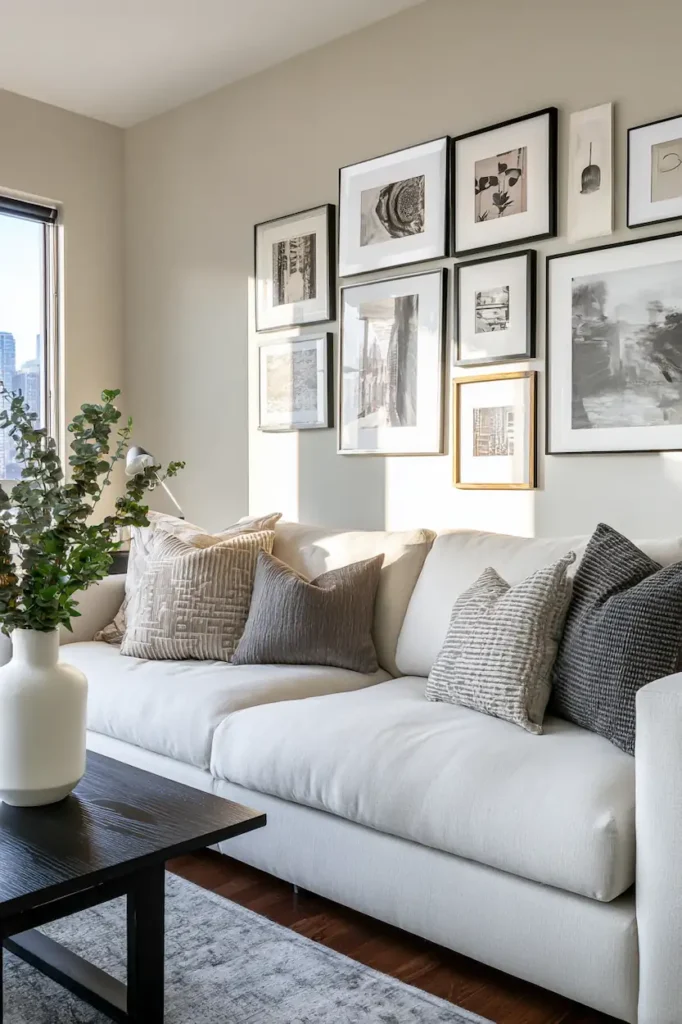
Equal spacing creates a quiet, editorial rhythm
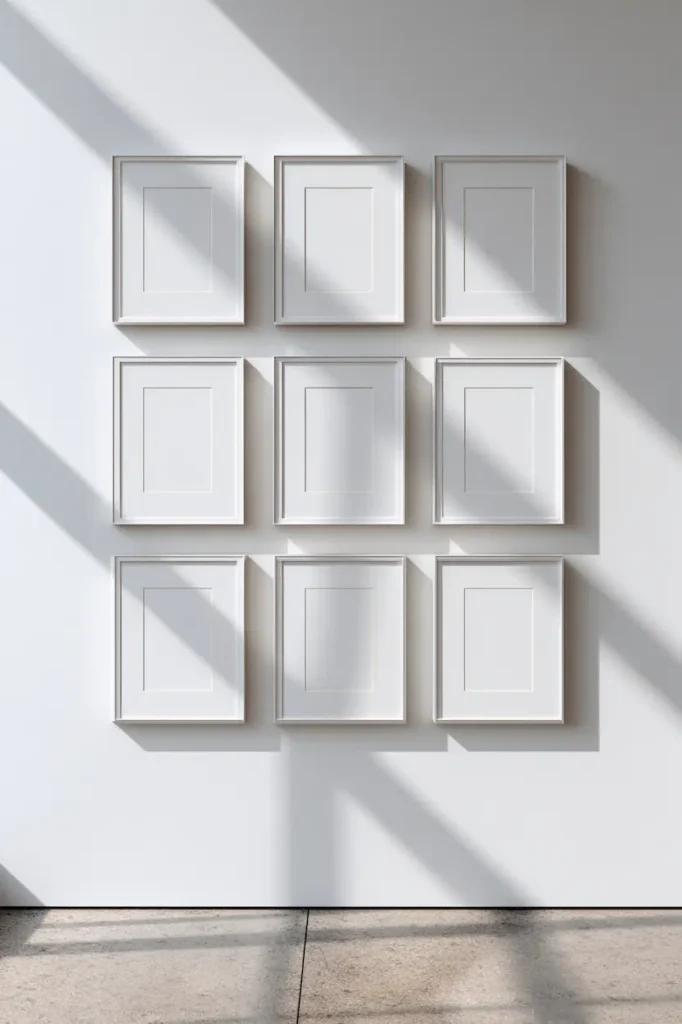
Equal spacing is visually reassuring.
When the gaps between frames are consistent, the wall adopts a gallery-like presence—calm, confident, composed. This rhythm works especially well in modern, Scandinavian, and minimalist interiors.
Visually, equal spacing:
- Reduces noise
- Makes mixed art styles feel unified
- Elevates even inexpensive prints
The wall stops shouting.
It starts holding space.
This is why equal spacing often feels “right” even when you can’t explain why. The eye recognizes order before the mind does.
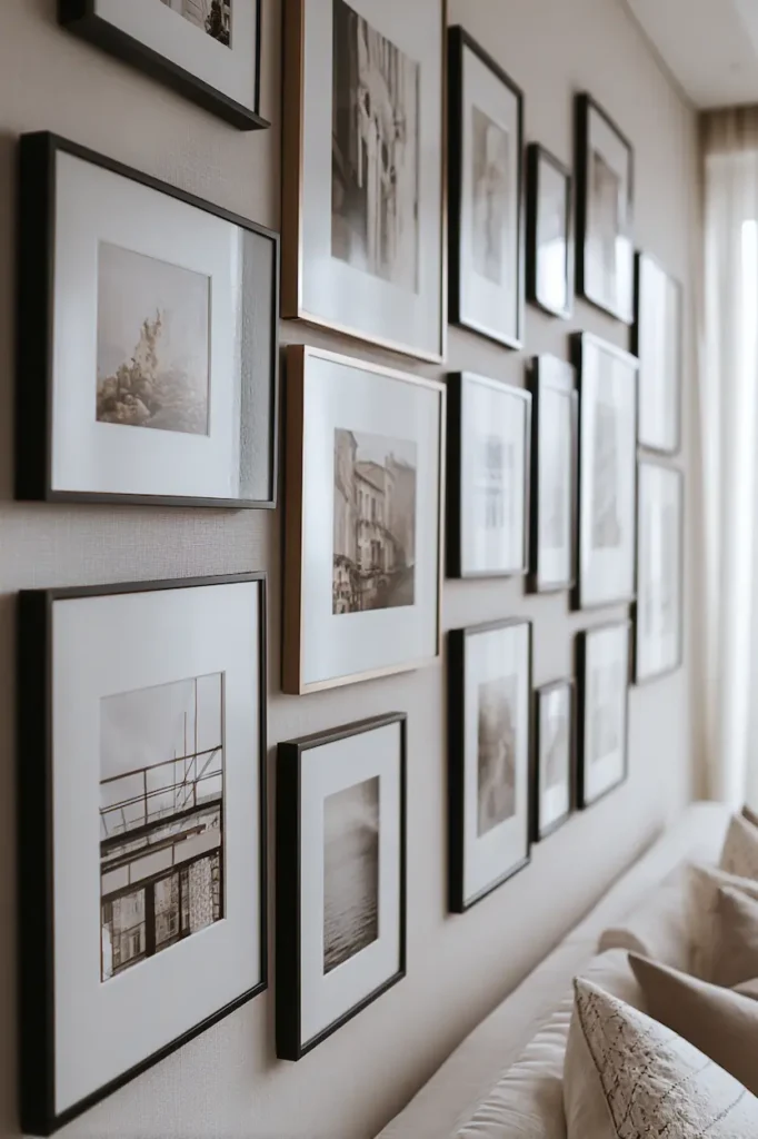
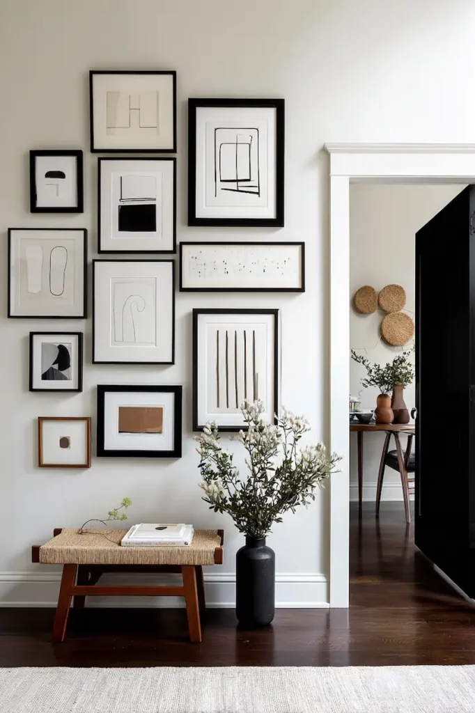
Tight spacing makes multiple frames feel like one statement
When frames sit closer together, something interesting happens:
the wall stops being about individual pieces.
Tight spacing creates density. Density creates impact.
This approach works when the goal isn’t to showcase each artwork, but to create a single visual mass—almost like a mural built from fragments.
The emotional effect:
- More intimate
- Slightly dramatic
- Intentional, collected over time
It’s especially powerful in smaller rooms, hallways, or reading corners, where you want the wall to feel immersive rather than expansive.
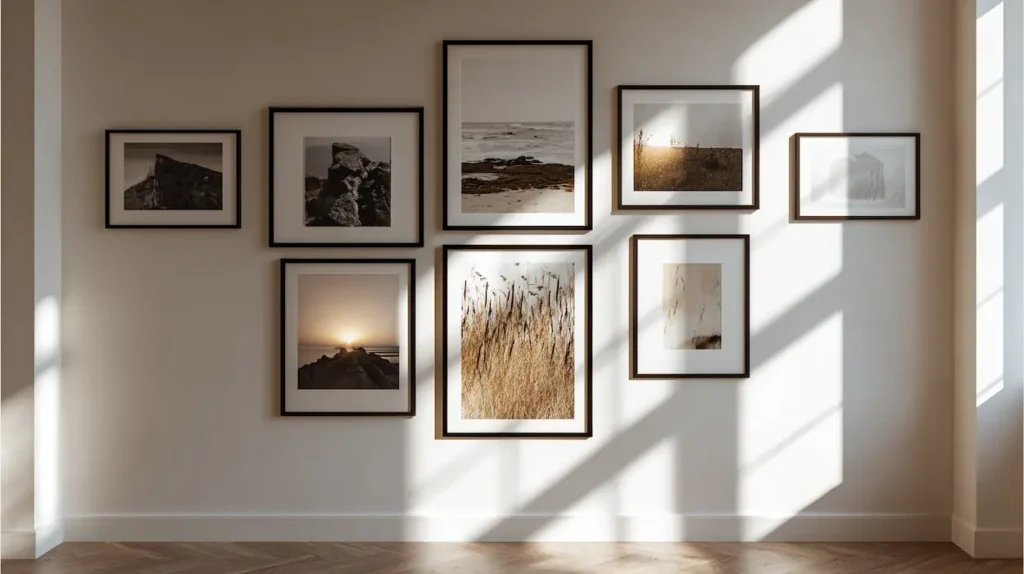
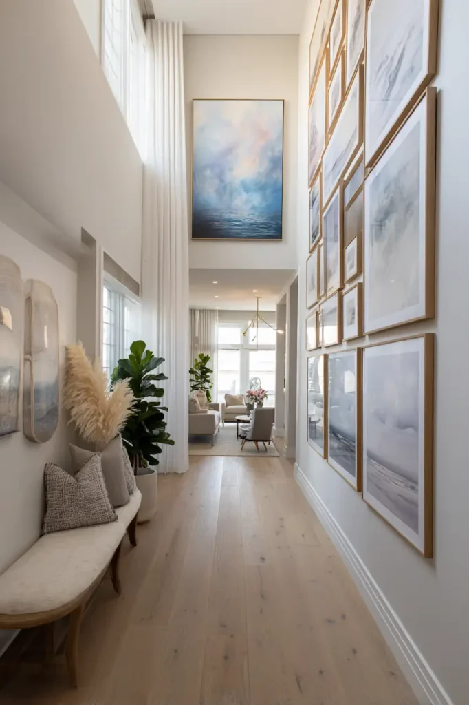
Wider spacing gives each piece room to breathe
Wide spacing shifts the energy entirely.
Each frame becomes its own moment. The wall feels lighter, slower, and more contemplative. This spacing works well when:
- Artworks are large or visually complex
- You want negative space to be part of the design
- The wall itself is already a strong architectural feature
Here, spacing isn’t emptiness.
It’s pause.
The eye moves, rests, and moves again—creating a gentle visual cadence that changes how the room is experienced.
Spacing controls scale more than frame size
Here’s the quiet truth: spacing affects perceived scale more than the frames themselves.
Tighter spacing makes a gallery wall feel larger and bolder.
Wider spacing makes the same wall feel smaller and more refined.
This is why a gallery wall can overwhelm a room even with small frames—or disappear despite large ones. The spacing sets the scale before the art even registers.
Once you understand this, spacing becomes a tool—not a rule.
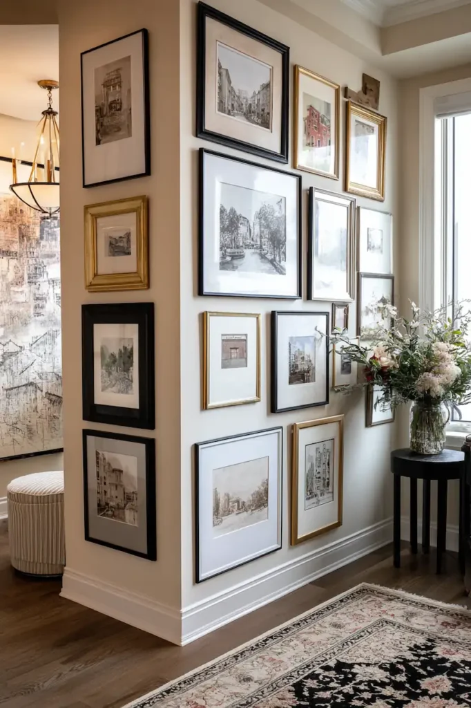
Alignment matters more than symmetry
Perfect symmetry is optional.
Alignment is not.
Even in organic, free-form gallery walls, invisible alignment lines are doing the heavy lifting. Tops, bottoms, or centers quietly relate to one another, keeping the wall visually grounded.
Good spacing without alignment still feels unstable.
Alignment without perfect symmetry feels effortless.
The wall doesn’t need to be balanced mathematically—just visually anchored.
Value Section — What Actually Works (And Why)
Practical Design Tips
- Use one spacing measurement throughout
Consistency matters more than the exact number. - Measure edge-to-edge, not frame-to-frame
Always measure the empty space between frames. - Step back often
Spacing should be judged from viewing distance, not arm’s length.
Step-by-Step Visual Guidelines
- Lay out frames on the floor with your chosen spacing
- Adjust until the wall reads as one shape
- Mark spacing points lightly before hanging
- Hang from the center outward to maintain rhythm
Common Spacing Mistakes
- Mixing multiple spacing sizes on the same wall
- Letting corners drift wider than the center
- Aligning frames randomly without a visual anchor
- Overcorrecting by making everything too tight
Recommended Measurements (Easy Reference)
- Standard look: ~5–7 cm (2–2.75 in)
- Tight, statement wall: ~3–4 cm (1–1.5 in)
- Airy, spacious feel: ~8–10 cm (3–4 in)
These aren’t rules. They’re visual ranges that tend to rebalance the wall naturally.
If you want to see how this clarity translates into real compositions, these gallery wall ideas show how spacing shapes the overall intention of a wall.
FAQ
Does spacing need to be identical everywhere?
Not technically—but visually, yes. The eye expects consistency.
Can I mix frame sizes with the same spacing?
Yes. Uniform spacing actually helps mixed sizes feel intentional.
Should spacing change with wall size?
Spacing affects perceived scale more than wall size itself.
Is tighter spacing always more modern?
Not always—but it often feels more deliberate and composed.
Conclusion
A gallery wall doesn’t fail because of the art.
It fails when the space between the art is unresolved.
Once spacing clicks, the wall settles. The room exhales.
And suddenly, the art feels like it belongs—exactly where it is.
This is the kind of clarity you’ll want to come back to.
The kind you save.