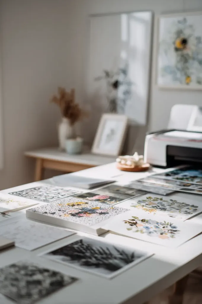
The moment you hit print is when your wall art begins its transformation — and the paper you choose decides everything.
You might already have a stunning design: colors that sing, lines that breathe. But on the wrong paper? It can feel flat, lifeless, or even cheap.
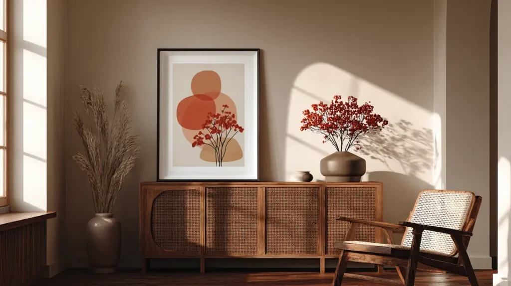
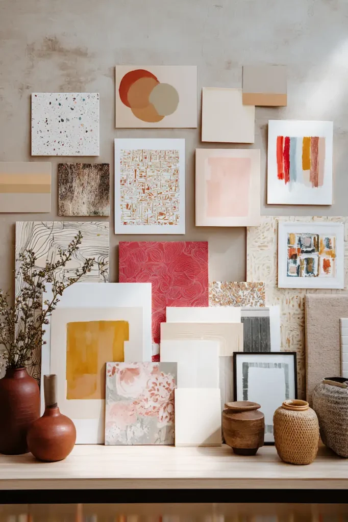
Best paper for printable wall art instantly upgrades a space — crisp details, rich tones, quiet texture, museum quality feel.
Whether it’s minimalist prints in your living room or vibrant botanical posters in your bedroom, the right paper deepens the emotion of your art.
In this guide you’ll discover what papers work best — and why — for every style of printable wall art you could imagine. Scroll to find your perfect match.
Choosing the best paper for printable wall art is only one part of the process. The way you print matters just as much — especially at home. This guide on printing wall art at home explains how paper, ink, and settings work together for a balanced result.
Best Paper for Printable Wall Art Transforms Color, Depth & Texture
Choosing the best paper for printable wall art isn’t about the fanciest name — it’s about how that surface interacts with your design and light in the room.
Your choice of paper decides:
🎨 Color accuracy — true, bright, rich, balanced.
📏 Sharpness & detail — from delicate lines to photographic clarity.
🖼️ Tactile experience — smooth modern feels, textured traditional feels, matte sophistication or subtle sheen.
This isn’t decoration — it’s visual emotion.
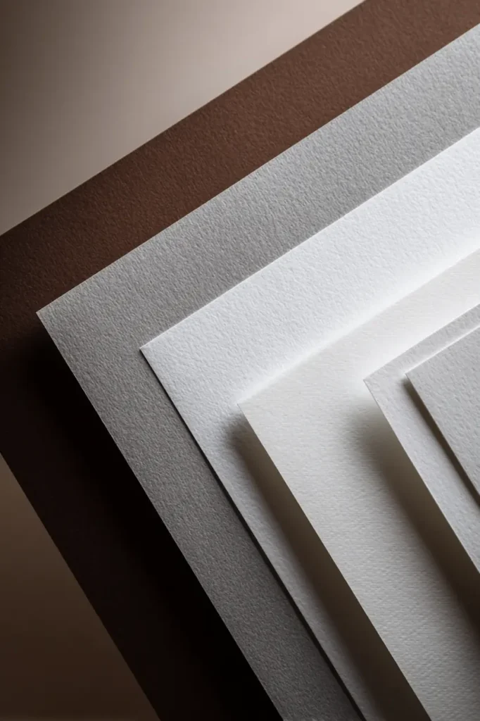
What Makes a Paper “Good” for Printable Art
Great printable wall art paper has a blend of:
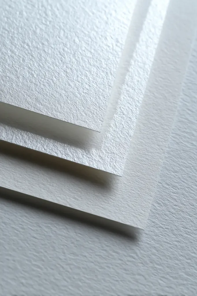
✔ Weight & density – heavier papers feel substantial.
✔ Surface finish – matte vs satin vs textured.
✔ Color reproduction – faithful to what you see on screen.
✔ Archival quality – acid-free for longevity.
These aspects change everything from contrast to how fast light absorbs or bounces — which directly affects how your art lives on the wall.
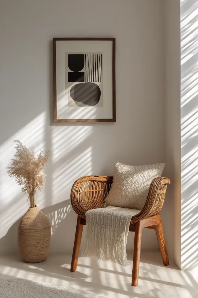
Museum & Gallery Vibes: Heavyweight Matte Fine Art Paper
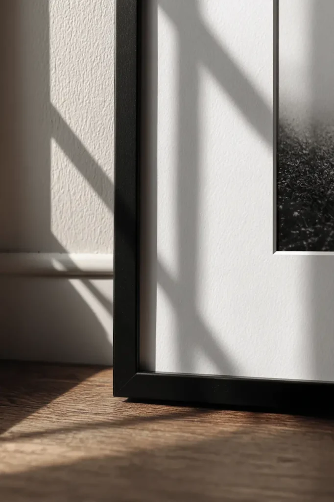
If your art relies on rich pigment and deep contrast, this is the go-to choice.
Why it works:
- Dense fibers hold ink without bleeding.
- Matte finish eliminates glare under direct light.
- Minimal sheen means emotional focus stays on the art — not reflections.
- Archival quality means decades of color stability.
Best for:
- Photographic prints with deep shadows
- Watercolor-style art
- Black-and-white minimalist posters
- Botanical illustrations
Visual mood: quiet luxury — every detail resonates, no distractions.
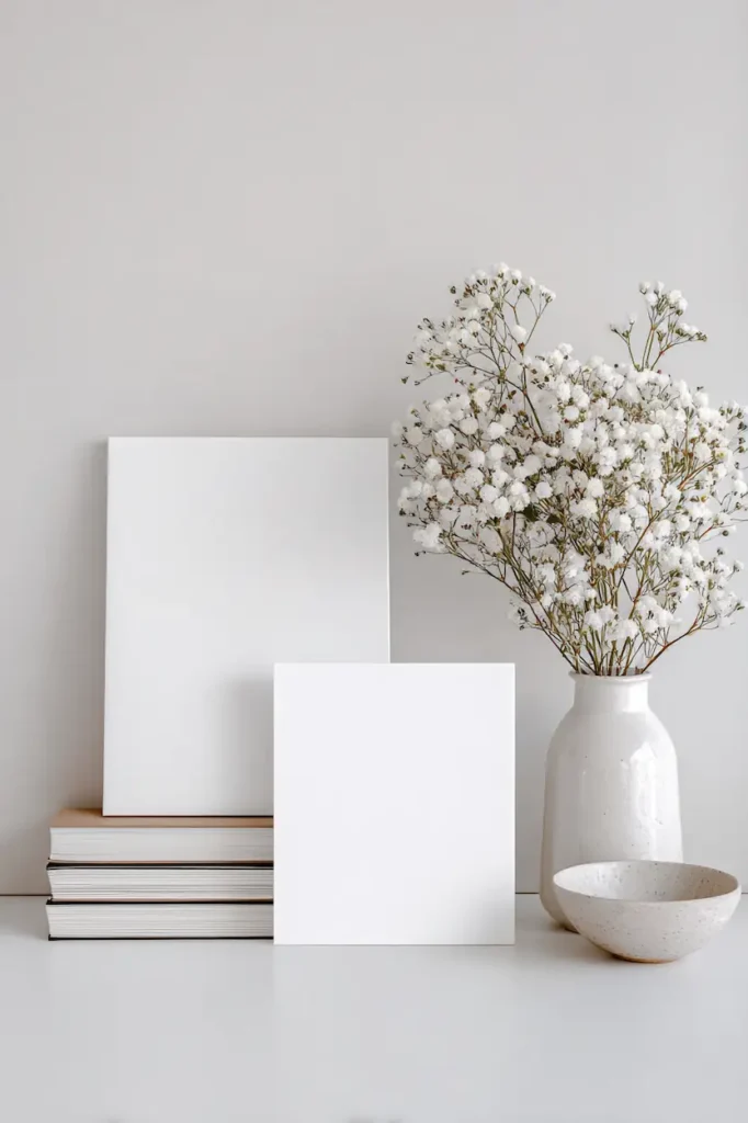
Everyday Excellence: Premium Bright White Matte Paper
This is the most versatile and often the easiest choice for printable wall art.
Why it works:
- Bright white boosts vibrancy without sheen.
- Ink sits clean and crisp.
- Works beautifully with inkjet printers at home.
- Affordable but still high quality.
Best for:
- Typography prints
- Flat color art
- Bold shapes and geometric patterns
- Kids’ room art
Visual mood: fresh, punchy, graphic clarity.
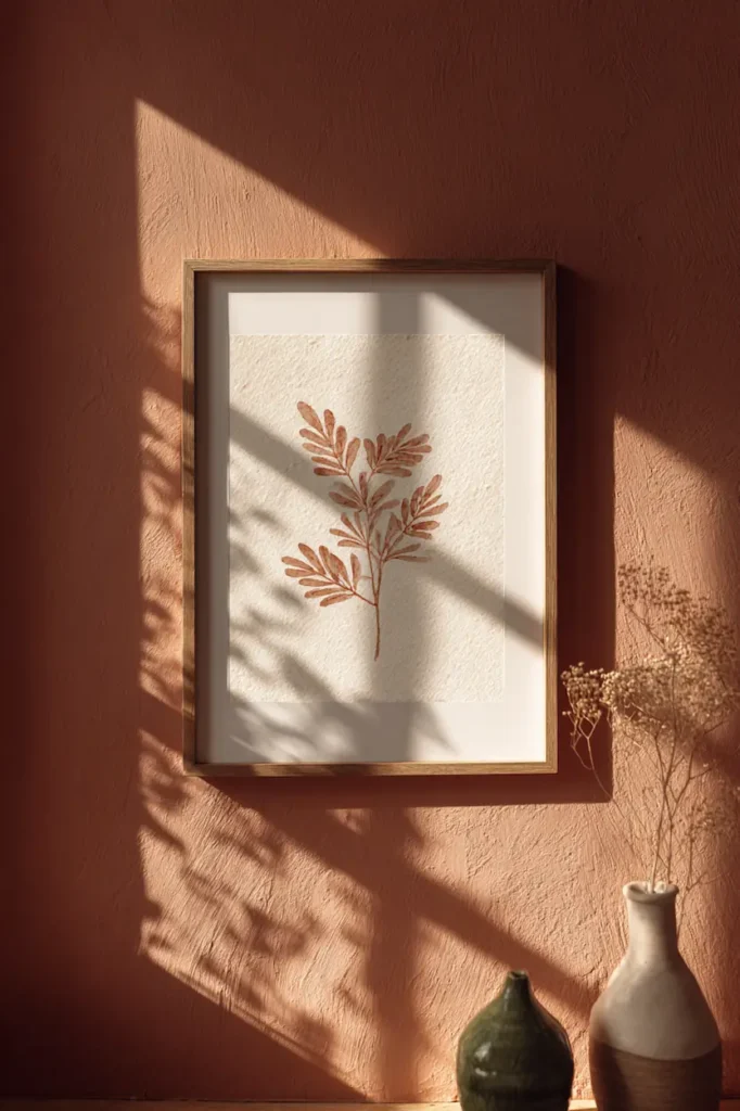
Soft Texture Warmth: Cotton / Fine Art Watercolor Paper
For art that feels hand-crafted, cotton or watercolor textured paper adds personality.
Why it works:
- Visible texture adds depth and richness.
- Excellent for art with brush-like strokes.
- Slightly diffuses light for a gentler presence.
Best for:
- Watercolor prints
- Pastel and sketch reproductions
- Organic botanicals
- Boho or ethereal interiors
Visual mood: organic, soulful, layered with character.
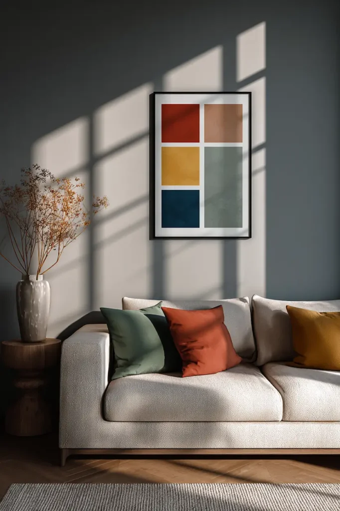
Subtle Sheen Elegance: Semi-Gloss or Satin Paper
Sometimes matte is too flat. A soft sheen can make colors pop gently without becoming glossy-poster loud.
Why it works:
- Balanced reflectivity enhances saturation.
- Especially good with bright, colorful art.
- Looks refined behind glass.
Best for:
- Vibrant florals
- Abstract color fields
- Modern minimal prints with strong hues
Visual mood: polished confidence — art that invites a second look.
Art for Mood & Space: Choosing by Style
Here’s a quick visual guide to pairing paper with the emotion you want to create:
| Art Style | Best Paper | Why |
|---|---|---|
| Minimalist line | Bright white matte | Clean edges, stark simplicity |
| Landscape photography | Matte fine art | Deep tones & crisp detail |
| Watercolor botanical | Textured cotton | Organic softness |
| Bold color abstract | Satin/semi-gloss | Gentle punch & refined glow |
| Black-and-white typographic | Heavy matte | Sharp contrast, no glare |
How Printer Type Changes Your Paper Choice
Inkjet Printers (Home or Studio)
- Pairs best with matte, heavyweight, or textured fine art papers.
- Ink absorption is strong — details stay sharp.
Professional / Photo Printers
- Can handle glossy finishes, satin, and high-end fine art stocks.
- Best with archival, acid-free papers for longevity.
💡 Tip: Match your paper type to both printer and art style — don’t assume glossy is always better.
Practical Tips for Frame-Ready Wall Art
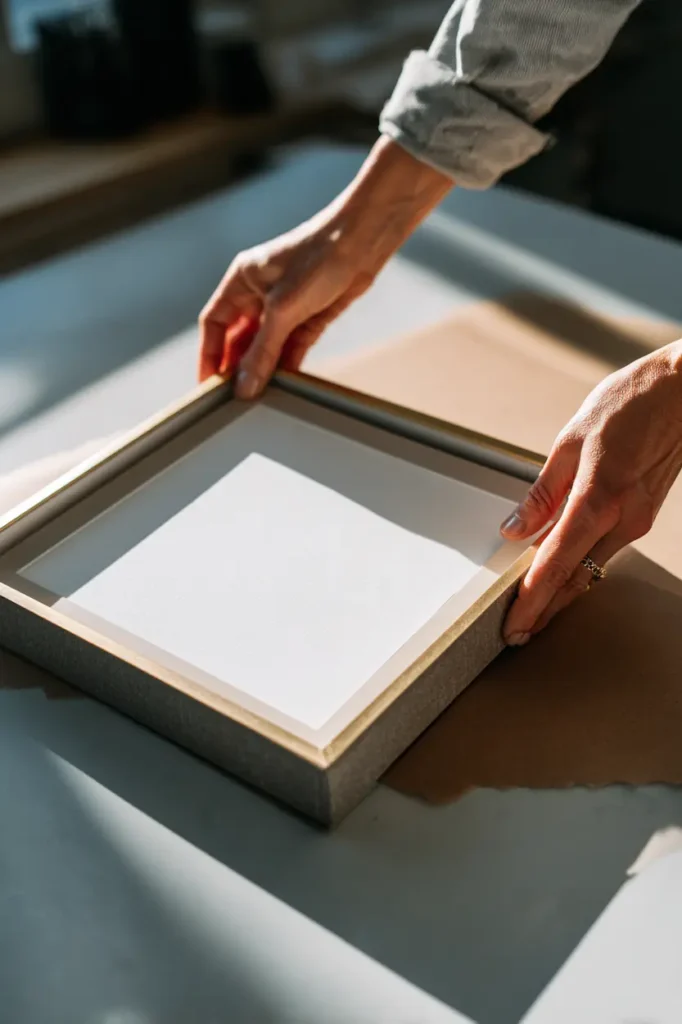
✔ Always print a small test strip before committing to a full sheet.
✔ Let prints dry fully — especially with heavy ink loads.
✔ Use acid-free matting to prevent aging around the edges.
✔ Clean frame glass inside before inserting — dust shows up instantly.
Common Mistakes When Printing Wall Art
❌ Choosing glossy paper for matte art — leads to glare and muted tones.
❌ Ignoring paper weight — flimsy prints look cheap, even if the design is great.
❌ Forgetting to calibrate your printer — colors drift without profiles.
❌ Skipping acid-free stock — prints yellow over time.
Best paper supports your art — it doesn’t fight it.
Wrap Up: Best Paper for Printable Wall Art Is About Experience
It’s not just about smooth vs textured, thick vs thin — it’s about how your art makes a space feel.
The best paper for printable wall art is the one that:
✨ Connects with your room’s light
✨ Enhances your design’s mood
✨ Feels intentional in texture and tone
✨ Ages gracefully over time
Your printable should look like a curated piece — not a quick print on scrap paper.