There is something quietly powerful about a simple poster wall.
No overload. No visual noise.
Just enough presence to make a wall feel intentional.
In a world saturated with images, simplicity feels radical.
And when posters are arranged with restraint, the wall stops shouting — it starts breathing.
This is where Poster Wall Ideas become less about decoration, and more about atmosphere.
About rhythm.
About letting the eye rest.
Below are approaches that transform empty walls into calm focal points — without complexity, without excess.
Poster Wall Ideas That Transform Silence Into Presence
A bare wall is not empty.
It’s waiting.
A simple poster arrangement doesn’t try to fill space.
It frames it.
One image.
Two.
Sometimes three.
Placed with intention, they create a pause in the room. A visual inhale.
The kind of wall that makes you slow down without knowing why.
The secret isn’t the poster itself.
It’s the spacing.
The breathing room around it.
Understanding choosing the right poster size for your wall is what allows simplicity to feel intentional rather than accidental.
Simplicity doesn’t mean minimal effort.
It means clear decisions.
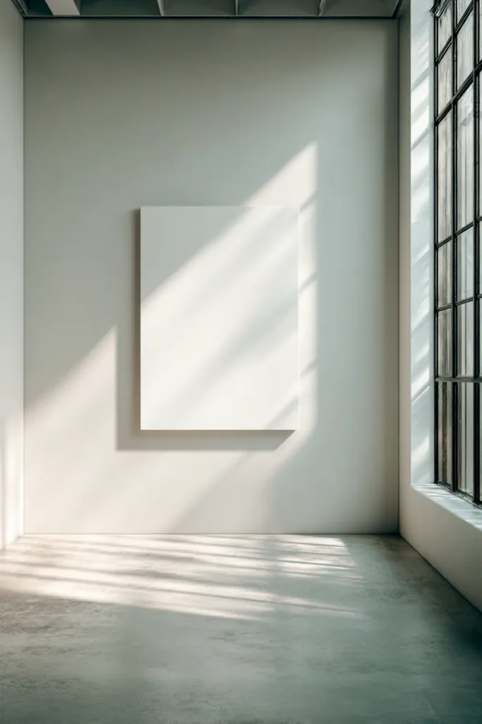
The Power of a Single Poster as a Visual Anchor
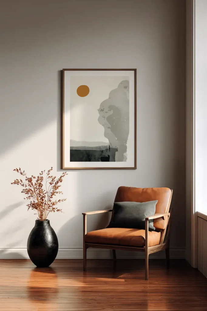
One poster can be enough.
More than enough.
When centered on a wall, it becomes an anchor — a quiet gravity point that stabilizes the entire room.
This works beautifully in:
- living rooms with neutral palettes
- bedrooms craving calm
- entryways that need a gentle statement
A single poster invites focus.
It tells the eye exactly where to land.
Choose artwork that carries emotion rather than detail.
Abstract forms.
Soft photography.
Muted typography.
The wall doesn’t feel decorated.
It feels composed.
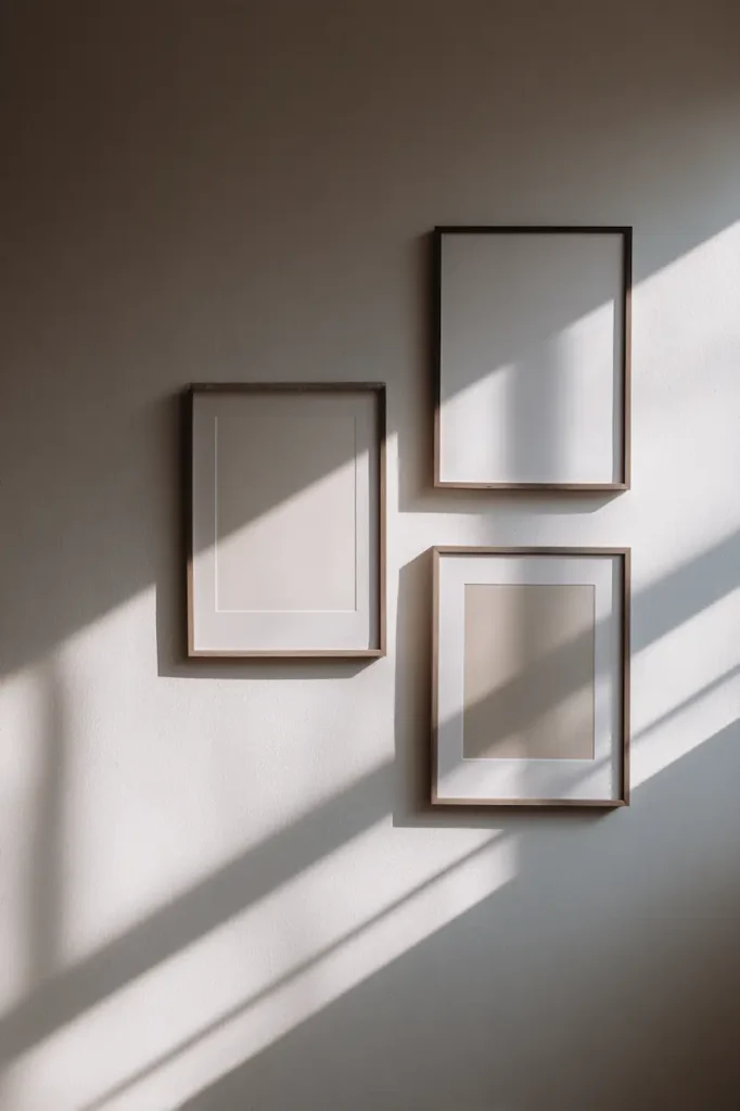
Two Posters That Create Balance Without Symmetry
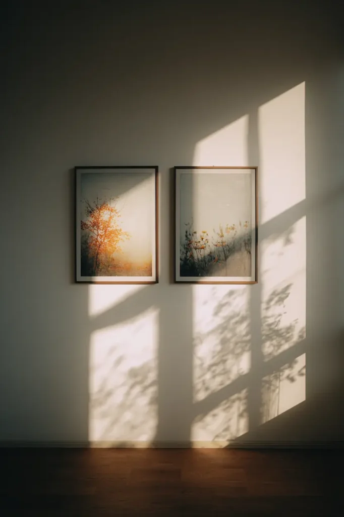
Two posters side by side can feel like a conversation.
Not identical.
Not mirrored.
Just related.
The beauty lies in slight imbalance:
- one image a touch lighter
- one frame slightly darker
- a shared color, not a shared subject
This kind of arrangement feels human.
Relaxed.
Unforced.
It works especially well above consoles, beds, or narrow walls where a single poster might feel lost.
The wall starts to feel designed — not decorated.
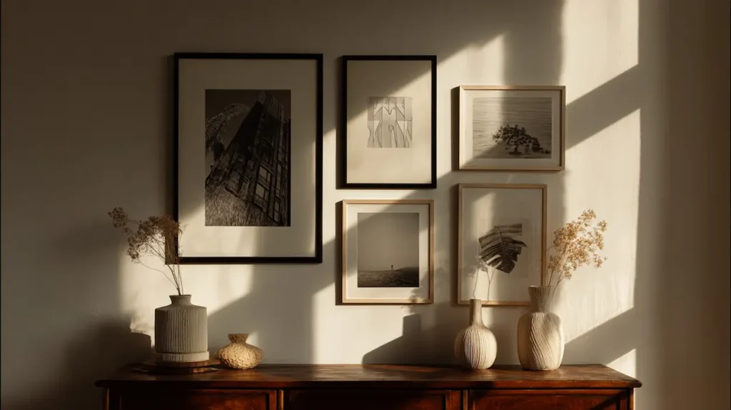
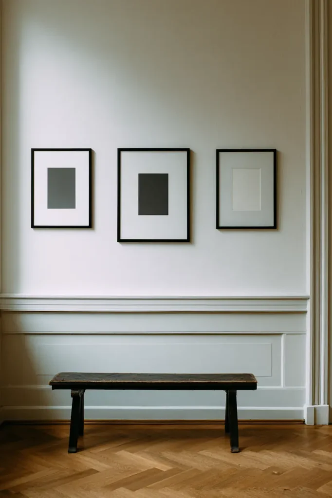
Three Posters That Add Rhythm Without Chaos
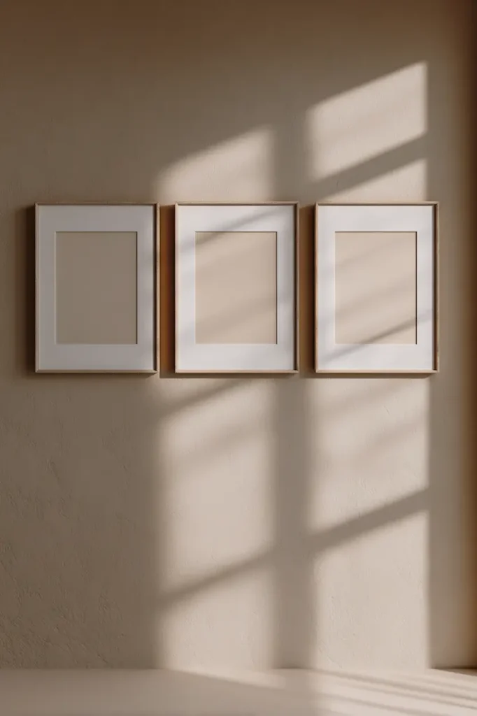
Three is a magical number.
Enough to create movement.
Not enough to overwhelm.
The key is alignment.
Horizontal rows feel grounded.
Vertical stacks feel architectural.
Loose triangles feel artistic — but still calm if spacing is generous.
What matters most is consistency:
- same frame color
- similar visual weight
- harmonious tones
The wall gains rhythm.
The room gains depth.
And still, everything feels easy on the eyes.
Why White Space Is the Most Important Element
White space isn’t empty.
It’s active.
It’s what allows posters to exist without competing.
It’s what turns an arrangement into a composition.
When posters are spaced too closely, the wall feels busy.
When space is respected, the wall feels intentional.
Think of the wall like a page.
The posters are words.
White space is the silence between sentences.
And silence is what makes meaning land.
Frame Consistency That Makes Everything Feel Calm
Frames are often underestimated.
Yet they shape the entire mood.
Simple arrangements thrive on consistency:
- thin black frames for contrast
- light wood for warmth
- white frames for softness
Mixing frames can work — but simplicity prefers unity.
When frames disappear visually, the posters speak more clearly.
The wall feels lighter.
The room feels quieter.
Simple Poster Walls That Adapt to Any Room
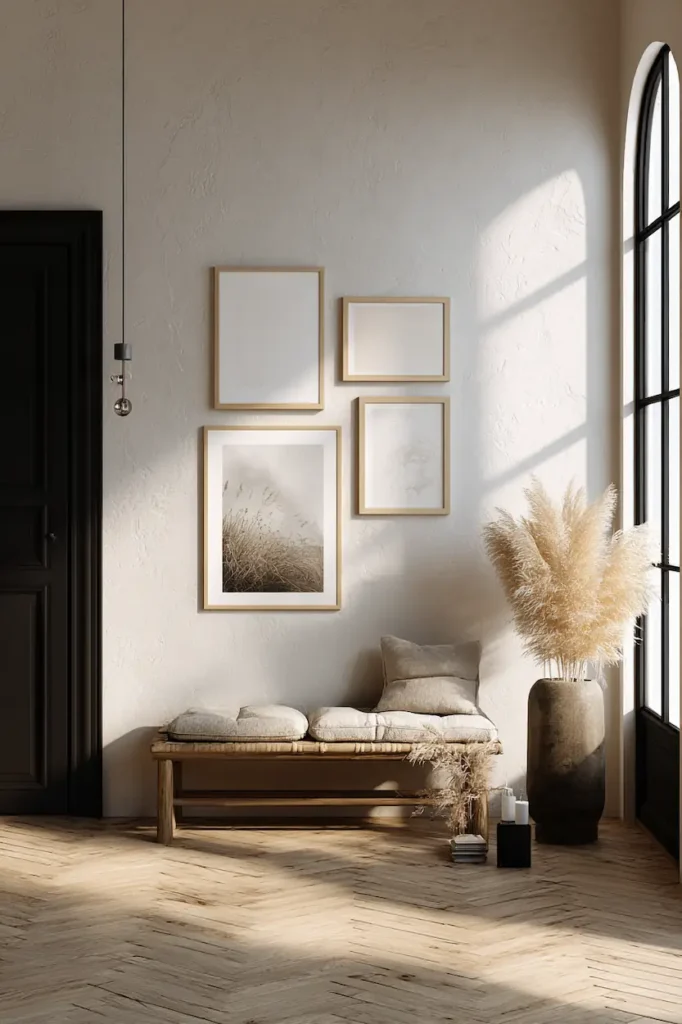
A minimalist poster wall isn’t limited to one space.
In a bedroom, it becomes a visual lullaby.
In a living room, a gentle focal point.
In a hallway, a moment of pause between rooms.
In a home office, a calm backdrop for focus.
The same principles apply everywhere:
- few posters
- generous spacing
- emotional coherence
Simplicity travels well.
Neutral Color Palettes That Age Beautifully
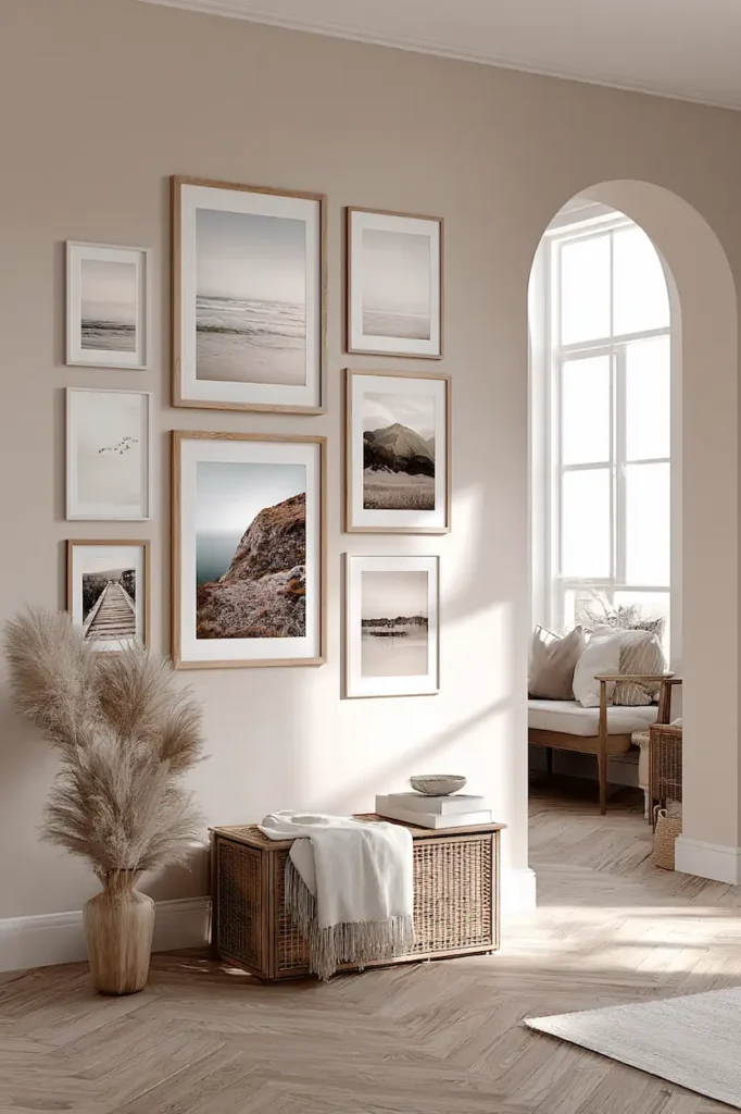
Simple poster walls love neutral tones.
Beige.
Soft gray.
Muted blacks.
Warm whites.
These palettes don’t chase trends.
They settle into the space.
They allow the wall to evolve with the room — new furniture, new light, new seasons — without ever feeling outdated.
Timelessness is the ultimate form of simplicity.
When Less Art Creates More Emotion
It sounds counterintuitive.
But fewer posters often create a stronger emotional impact.
The eye isn’t distracted.
The mind isn’t overloaded.
Each piece has space to resonate.
A simple arrangement doesn’t ask for attention.
It earns it.
FAQ – Simple Poster Wall Inspirations
Can a poster wall feel warm and not cold?
Yes. Warm frames, soft colors, and generous spacing create intimacy even in minimal setups.
Is symmetry required for a simple look?
Not at all. Balance matters more than symmetry. Slight asymmetry often feels more natural.
How do I avoid making the wall feel empty?
Choose posters with emotional depth. Simplicity relies on feeling, not quantity.
Do simple poster walls work in small spaces?
They work especially well. Fewer elements make small rooms feel more open and intentional.
A Wall That Finally Feels Right
Simple poster walls don’t try to impress.
They try to belong.
They settle into a room quietly.
They grow with your space.
They allow your home to breathe.
Sometimes, the most powerful transformation comes from doing less — and choosing better.
Look at your wall again.
It might already be telling you what it needs.