A poster alone is an idea.
A framed poster is a presence.
The difference is subtle, almost invisible at first glance.
Yet it changes everything: how the wall breathes, how the room feels, how your eye slows down.
Framing isn’t about perfection.
It’s about intention.
And when it’s done right, even the simplest poster suddenly feels curated — as if it has always belonged there.
Framing posters transforms simple prints into visual anchors
A framed poster doesn’t just decorate a wall.
It holds the wall.
It creates a pause.
A focal point.
A moment where the eye knows where to rest.
Without a frame, a poster can feel temporary — like a thought not fully expressed.
With a frame, it becomes deliberate.
Almost architectural.
You don’t need expensive materials.
You don’t need museum rules.
You need coherence, restraint, and a sense of rhythm.
That’s where the “pro” feeling quietly appears.
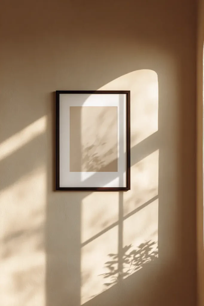
The frame is not an accessory, it’s a border of silence
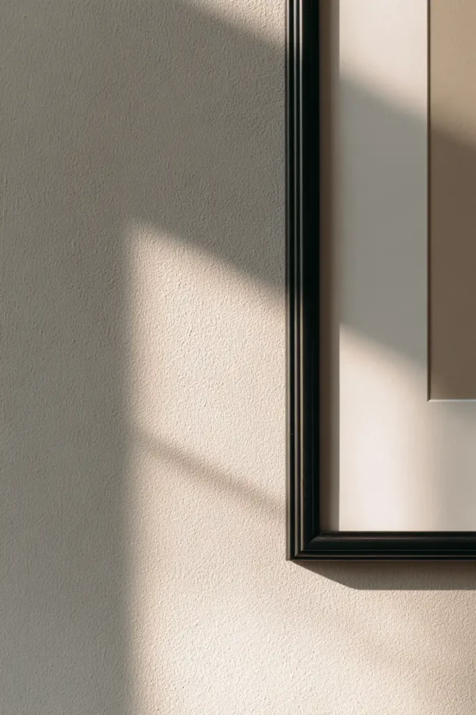
Think of the frame as negative space made solid.
It separates the image from the noise of the room.
It gives the poster room to breathe.
Thin frames whisper.
Thick frames ground.
Light wood softens.
Black sharpens.
White disappears.
A professional look often comes from choosing frames that don’t compete — they support.
When the frame disappears emotionally, the poster speaks louder.
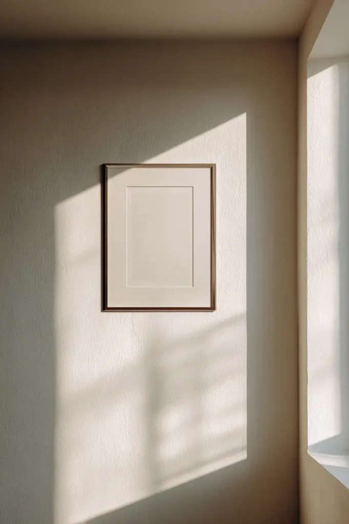
Matting changes everything without anyone noticing why
Passe-partout.
Mat.
White margin.
Call it what you want — it’s one of the most powerful framing tools.
A mat gives the artwork distance from the frame.
It adds air.
It elevates even the most minimal poster.
The effect is calm, almost subconscious.
The wall suddenly feels slower. More considered.
A small print with a generous mat often looks more intentional than a large print without one.
This is one of those “easy tips” that professionals rely on constantly — because it never shouts.
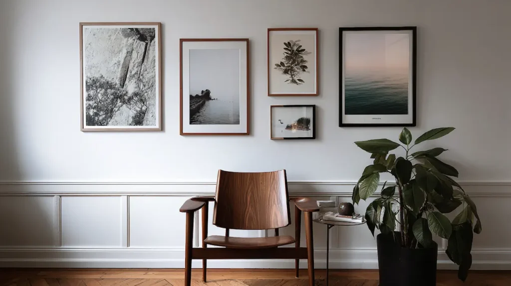
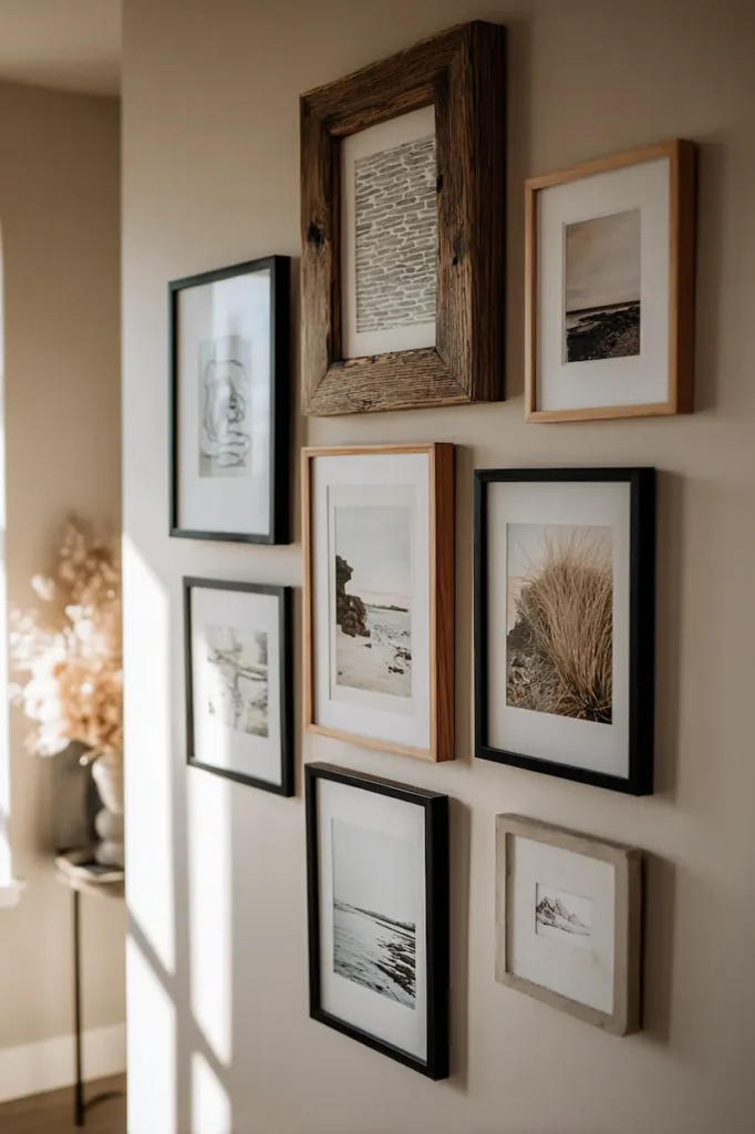
Consistency beats creativity when several posters share a wall
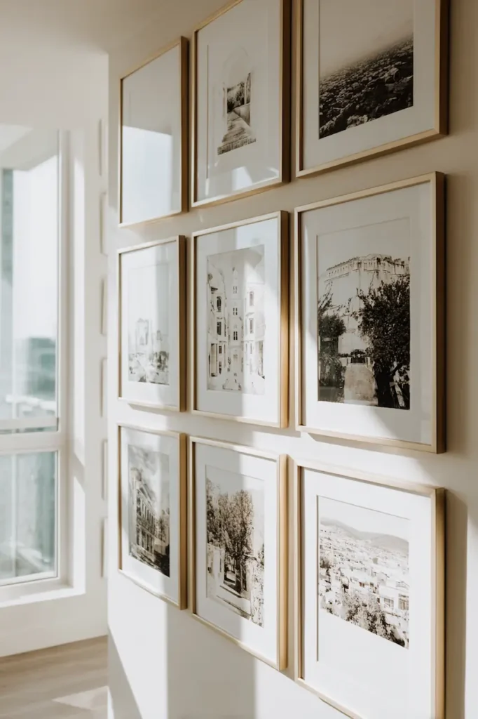
Gallery walls fail when every frame tries to be special.
They succeed when the wall reads as one gesture.
You can mix images.
You can mix moods.
But keep something constant:
- same frame color
- same frame thickness
- same mat color
- same visual weight
Consistency creates calm.
Calm feels expensive.
This is why the most effective poster wall ideas that rely on balance rather than excess never feel decorative — they feel considered.
The eye understands the system — and stops fighting it.
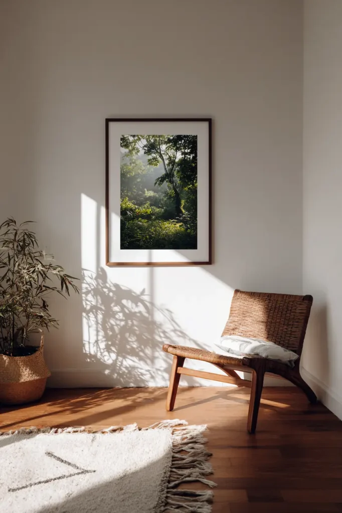
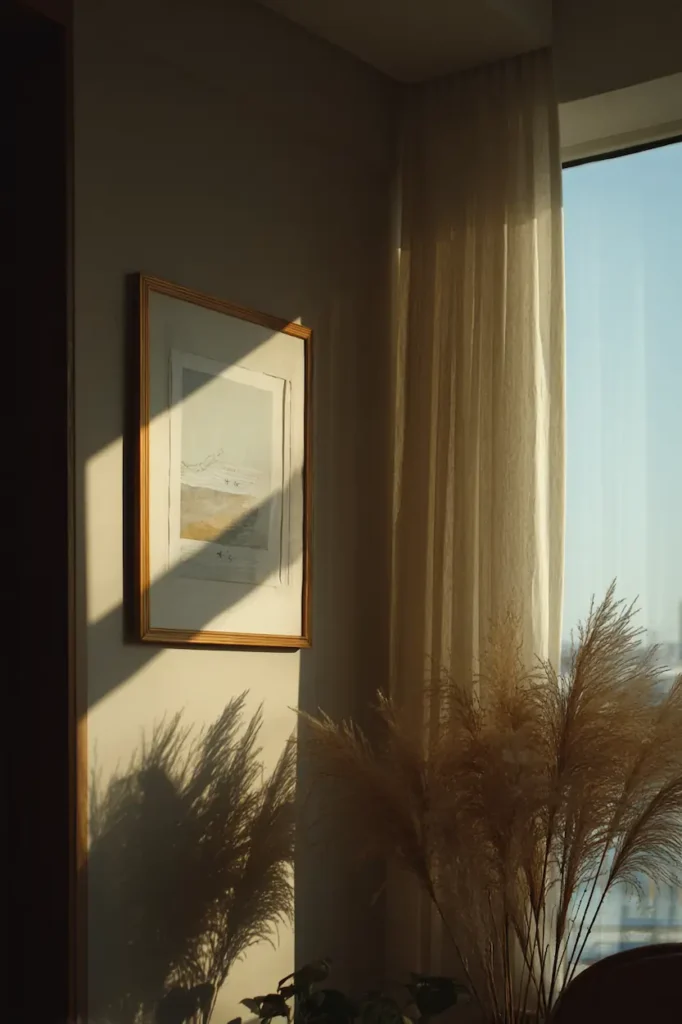
Wall color is part of the frame, whether you plan it or not
A framed poster never exists alone.
It lives against a color.
Soft walls make frames gentler.
Dark walls make frames sharper.
Textured walls add depth.
A white frame on a white wall feels airy and editorial.
A black frame on a warm beige wall feels graphic and confident.
Professionals don’t choose frames only for the poster.
They choose them for the dialogue between wall, frame, and light.
That’s where harmony lives.
Spacing between frames is where the rhythm is decided
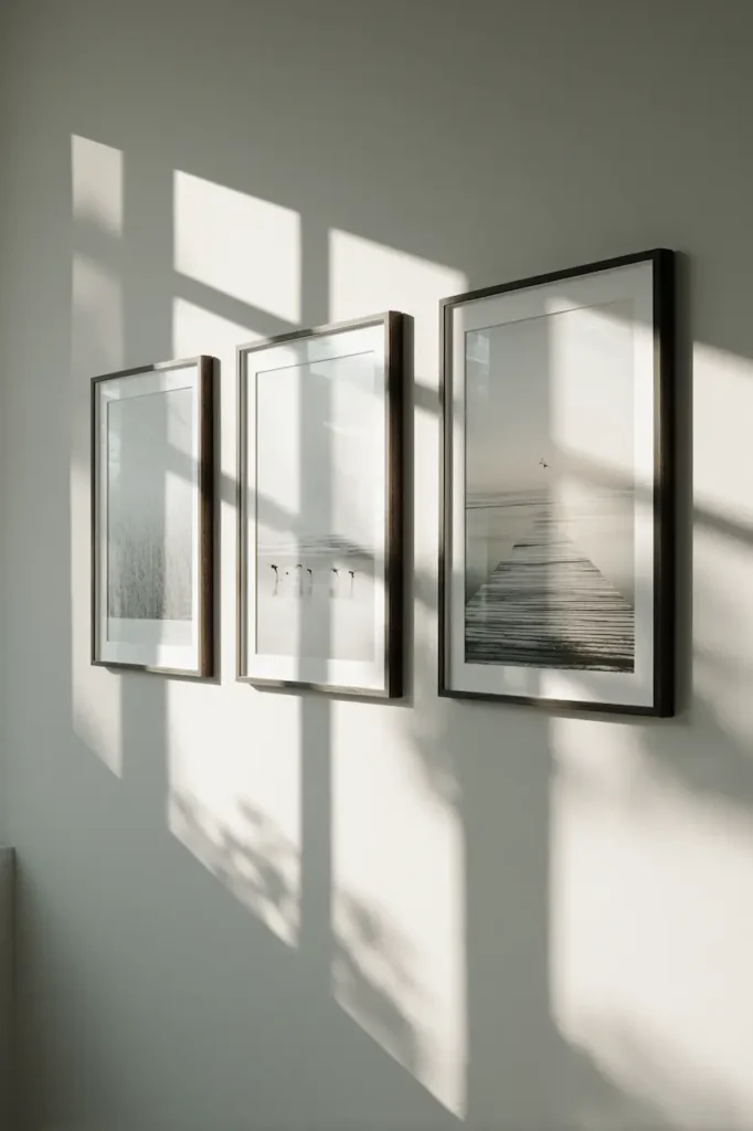
Too close, and the wall feels nervous.
Too far, and it loses connection.
Equal spacing creates calm geometry.
Slight irregularity adds life — but only when intentional.
A good rule emotionally (not technically):
If your eye jumps, the spacing is wrong.
If your eye flows, you’re there.
This is one of the quiet details that makes a wall feel designed rather than assembled.
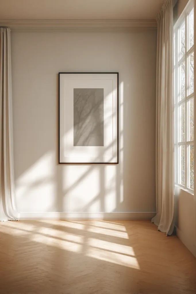
Height is about eye contact, not rules
Forget measurements.
Think human.
A framed poster should meet your gaze, not float above it.
When art is too high, it disconnects from the room.
When it’s too low, it feels temporary.
The most professional walls feel conversational — like the artwork is aware of you.
Stand back.
Breathe.
Adjust until it feels natural.
Your body knows before your ruler does.
Mixing frame styles works best when the mood stays the same
You can mix wood and metal.
You can mix thin and thick.
But keep the emotional tone consistent.
Calm with calm.
Bold with bold.
Soft with soft.
A wall that mixes moods feels undecided.
A wall that commits feels confident.
Professionals don’t avoid contrast — they curate it.
Glass choice affects light more than the image itself
Reflections can kill a wall’s energy.
If the room has strong natural light, glass matters.
Matte or anti-reflective options keep the poster present instead of disappearing into glare.
The goal isn’t shine.
It’s readability.
A poster should feel seen at all hours, not only at night.
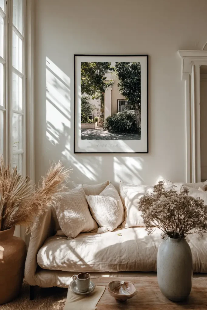
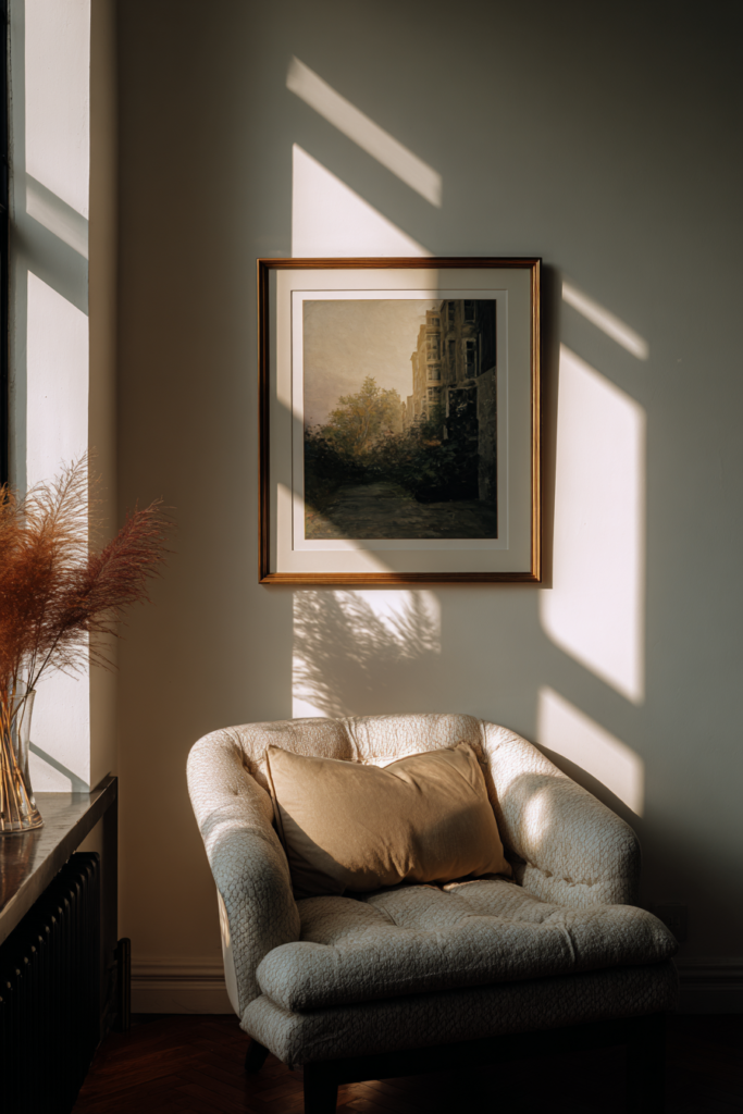
Less framing often feels more luxurious
One framed poster, perfectly placed, can do more than ten crowded ones.
Empty wall around a frame isn’t wasted space.
It’s emphasis.
Professionals understand restraint.
They allow the wall to breathe — and the poster to matter.
Sometimes the most “pro” choice is stopping earlier than planned.
Framing is how a wall starts telling a story
When posters are framed with intention, the wall changes role.
It stops being background.
It becomes narrative.
It reflects taste without explaining it.
It shows care without showing effort.
And that’s the real secret behind a professional look:
Nothing feels forced.
FAQ — Framing posters with confidence
Do all posters need frames to look good?
No. But framing gives them permanence and intention that walls respond to immediately.
Is it better to match all frames exactly?
Matching creates calm. Mixing works when there’s a clear visual logic behind it.
Can inexpensive frames still look professional?
Absolutely. Simplicity, consistency, and spacing matter more than price.
How many framed posters are too many?
When the wall feels loud instead of balanced, it’s time to remove one.
Conclusion — When a poster feels at home on the wall
Framing isn’t a finishing step.
It’s a translation.
It translates an image into an atmosphere.
A wall into a statement.
A room into something more personal.
Once you notice the difference, you can’t unsee it.
And you’ll never look at an empty wall — or an unframed poster — the same way again.