Vintage posters are not decoration in the usual sense.
They are traces of another rhythm, another way of looking at the world.
A single poster can shift the emotional temperature of a room.
A wall that felt neutral suddenly feels inhabited.
Lived-in.
Remembered.
This guide isn’t about rules or periods or collecting logic.
It’s about perception.
About how vintage posters speak to space, light, and memory — and how to let them do that quietly, beautifully.
Vintage posters transform empty walls into emotional surfaces
A blank wall is silent.
A vintage poster gives it a voice.
Not a loud one.
A textured voice, slightly worn, human.
Vintage posters carry time in their paper, their colors, their imperfections.
When placed on a wall, they don’t shout for attention.
They settle in — like a memory that was always meant to be there.
They work because:
- their palettes feel softened, never aggressive
- their typography feels intentional, not decorative
- their imagery suggests stories without explaining them
A wall with vintage posters doesn’t feel styled.
It feels discovered.
Why vintage posters feel warmer than modern prints
Modern prints often aim for precision.
Vintage posters accept imperfection — and that’s where their warmth comes from.
The slightly faded inks.
The uneven edges.
The sense that the image has already lived somewhere else before arriving here.
Visually, they:
- absorb light instead of reflecting it harshly
- blend naturally with textured walls
- soften architectural lines
Emotionally, they:
- suggest nostalgia without being literal
- feel personal even when mass-produced
- create familiarity in new spaces
A room with vintage posters feels less “designed” and more felt.
Choosing vintage posters by feeling, not by era
You don’t need to know decades.
You don’t need to name movements.
You only need to notice how a poster makes you slow down.
Some feel calm.
Some feel optimistic.
Some feel quietly bold.
When choosing, ask yourself:
- Does this poster calm or energize the room?
- Does it invite the eye to linger?
- Does it feel like it belongs to the wall, not just on it?
The right vintage poster doesn’t compete with your space.
It completes it.
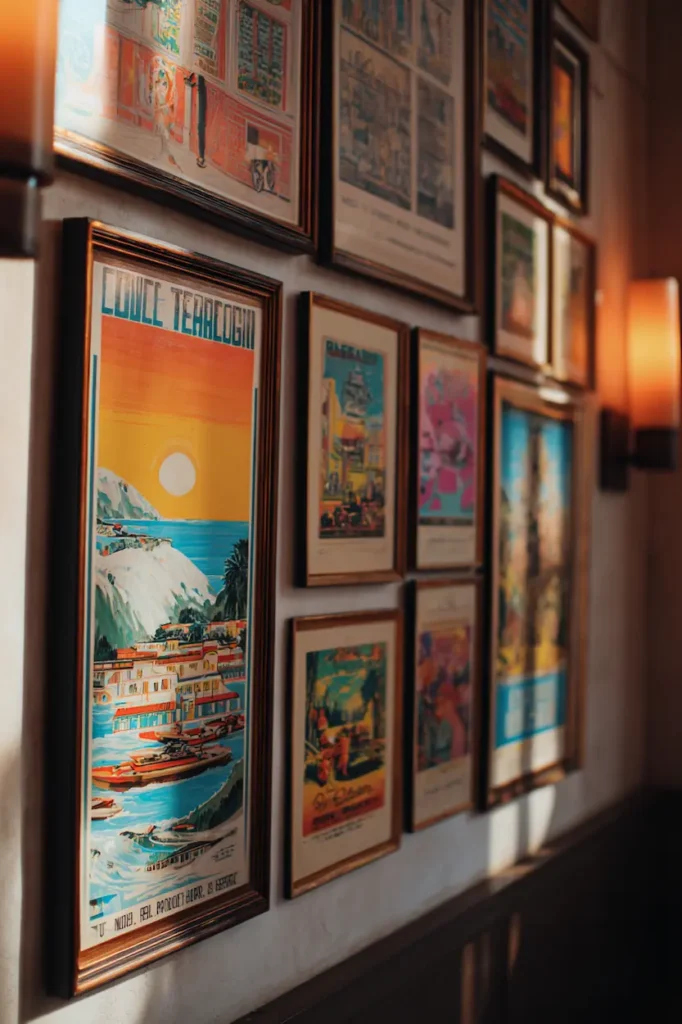
Color palettes that let the wall breathe
Vintage posters are masters of restraint.
Muted reds.
Dusty blues.
Warm creams.
Soft blacks that aren’t really black.
These colors don’t dominate a wall — they coexist with it.
They work especially well when:
- walls are neutral or textured
- light is natural and directional
- the room already has material warmth (wood, linen, stone)
Instead of contrast, they create harmony.
Instead of impact, they create atmosphere.
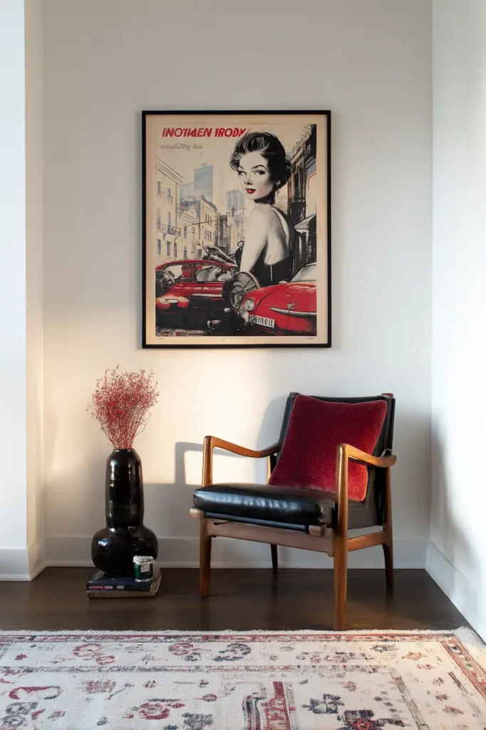
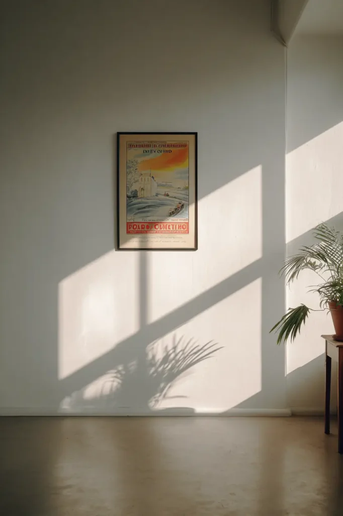
How scale changes the emotional weight of a poster
Size is not about filling space.
It’s about presence.
A large vintage poster:
- feels cinematic
- anchors the room
- turns the wall into a backdrop
A small vintage poster:
- feels intimate
- rewards close attention
- works like a visual whisper
Both are valid.
What matters is intention.
One strong poster can say more than five competing ones.
Especially when it’s allowed to breathe.
Framing that respects the age of the image
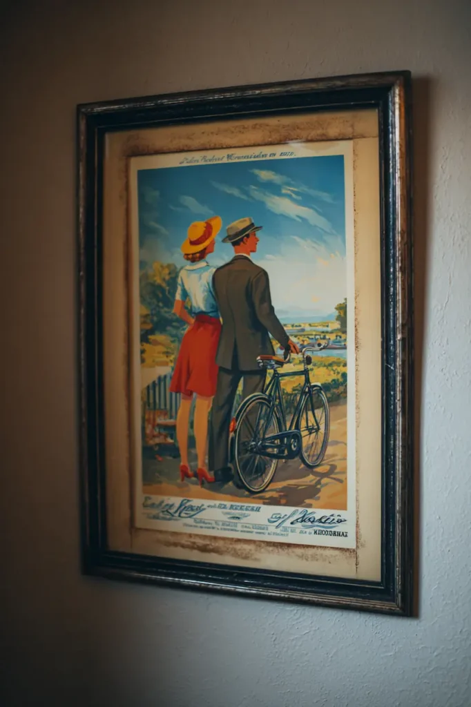
Frames should never overpower vintage posters.
They should disappear.
The best options are:
- thin black frames
- soft wood with visible grain
- slightly off-white mats
Avoid anything glossy or ornate.
The poster already carries history — the frame is just there to protect the silence around it.
Choosing frames that enhance vintage posters without overpowering them is often what separates a wall that feels styled from one that feels lived in.
Sometimes, unframed posters work too.
Especially when the wall texture supports them.
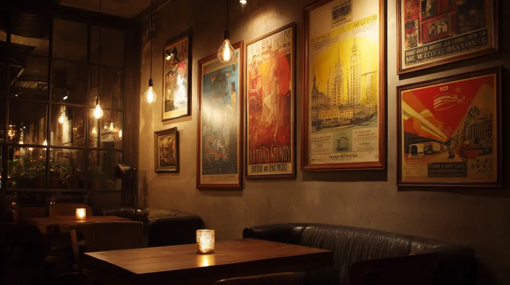
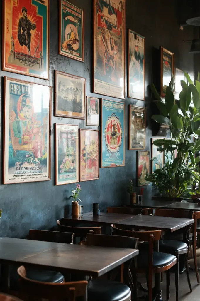
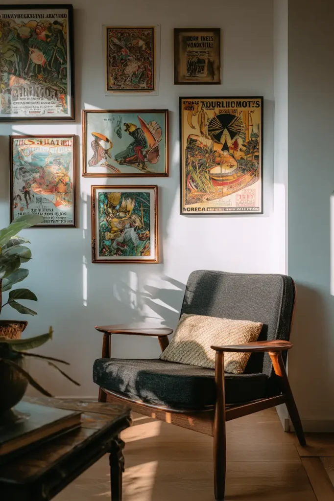
Gallery walls that feel collected, not curated
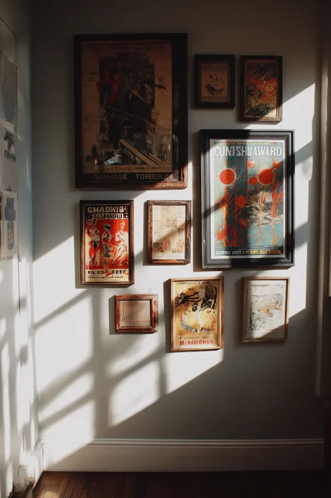
A vintage poster gallery wall should never look planned.
It should feel like:
- posters found at different moments
- stories gathered over time
- visual memories sharing a surface
To achieve that:
- mix sizes gently
- leave irregular spacing
- let one poster be slightly off-center
The wall should feel human.
Not symmetrical.
Not perfect.
That imperfection is the point.
Vintage posters in different rooms, different energies
Vintage posters adapt to spaces surprisingly well.
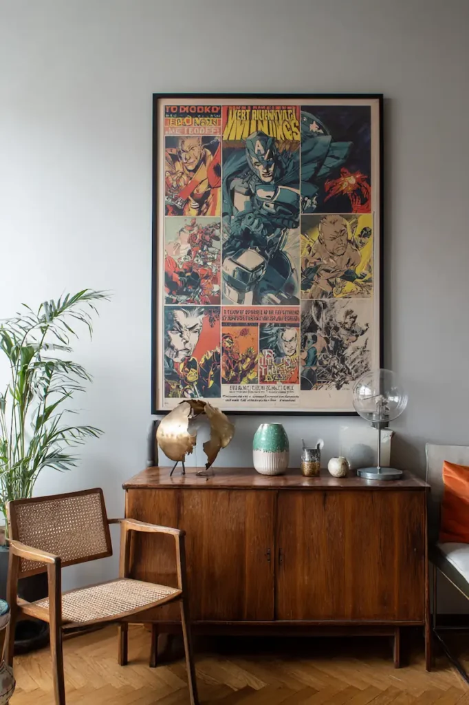
In living rooms, they:
- soften modern furniture
- create a focal point without heaviness
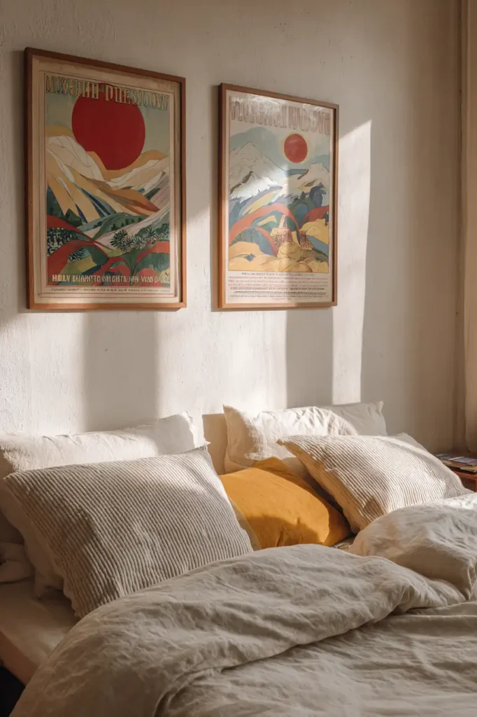
In bedrooms, they:
- add intimacy
- suggest calm narratives
In kitchens or dining spaces, they:
- bring playfulness
- add character without clutter
Even hallways benefit from them.
They turn transitions into experiences.
Light as the silent collaborator
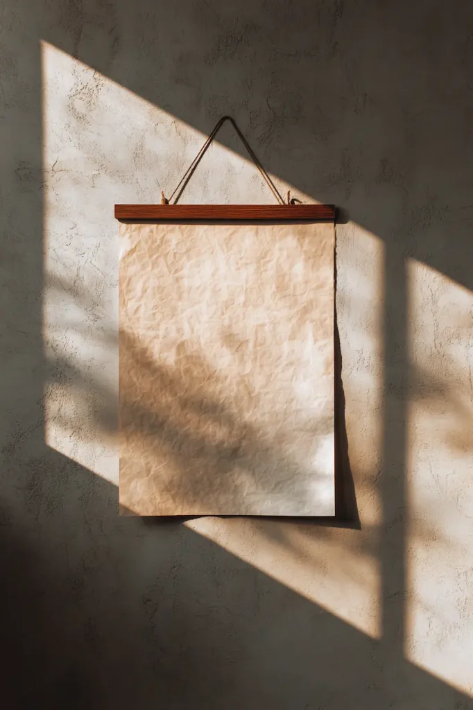
Vintage posters love soft light.
Natural light that changes during the day reveals:
- subtle color variations
- paper texture
- depth in illustration
Avoid harsh spotlights.
Let shadows exist.
A poster that shifts with daylight feels alive.
And that’s when a wall truly works.
Mixing vintage posters with contemporary interiors
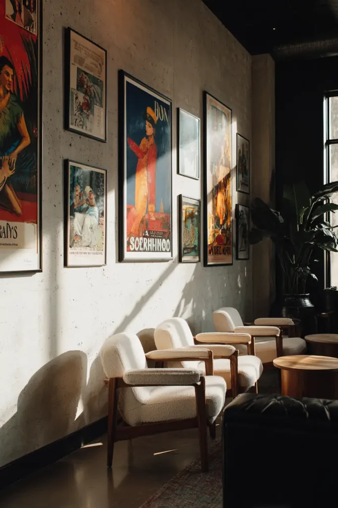
Vintage doesn’t mean old-fashioned.
In contemporary spaces, vintage posters:
- break visual coldness
- add narrative contrast
- humanize clean lines
The tension between modern furniture and aged imagery creates balance.
The room feels intentional, but not rigid.
Designed, but not distant.
When fewer posters say more
Restraint amplifies meaning.
One well-placed vintage poster can:
- define the mood of an entire room
- guide color choices elsewhere
- become the emotional anchor of the space
Don’t rush to fill walls.
Let them wait.
The right poster always arrives at the right moment.
FAQ — Vintage posters, simply answered
Do vintage posters work in minimalist interiors?
Yes. They add warmth and story without breaking visual calm.
Should vintage posters match the room colors?
They should echo them, not replicate them.
Is it better to frame or leave them raw?
Both work. It depends on the wall texture and the mood you want.
Can vintage posters feel modern?
Absolutely. When paired with contemporary elements, they feel timeless.
A wall is never just a wall
It listens.
It reflects.
It absorbs what you place on it.
Vintage posters don’t decorate walls.
They settle into them.
They remind us that spaces don’t need more objects —
they need more meaning.
And sometimes, all it takes is one poster
to change how a room feels
every single day.