You’ve picked the perfect piece — but now you’re stuck on size. Should it be 11×14 vs 16×20? The difference isn’t just inches; it’s mood, balance, and presence.
Right away: 16×20 feels bolder and more intentional — it anchors a wall and draws the eye. 11×14 feels intimate and refined, perfect where calm and subtlety matter.
Every room has a voice — and the size you choose sets its volume.
Keep scrolling. You’ll see how each dimension lives in real spaces, how to pair them with furniture, and how to choose based on emotional impact — not just measurements.
When 11×14 Becomes the Sweet Spot
11×14 may look modest on paper — but in real interiors it brings proportion, poise, and a breath between objects.
Visual Impact
11×14 feels personal. It’s like a gentle whisper — it doesn’t shout, it suggests.
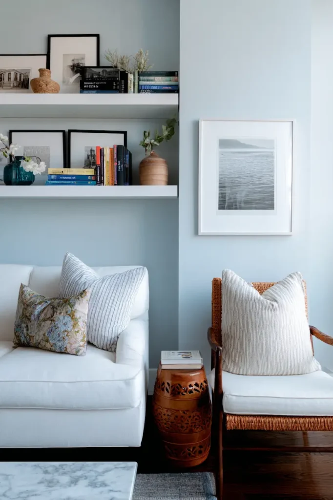
In a gallery wall, several 11x14s create rhythm without chaos. Against a floating shelf, it sits just right.
Best For
- ✦ Bedrooms and nooks
- ✦ Home offices and reading corners
- ✦ Gallery walls with multiple pieces
- ✦ Paired placements (e.g., two horizontals side-by-side)
Emotional Feel
11×14 says: “Notice this. Without overwhelming.” It invites you closer.
How 16×20 Changes the Room’s Gravity
16×20 isn’t just bigger — it anchors. It gives the wall purpose.
Visual Impact
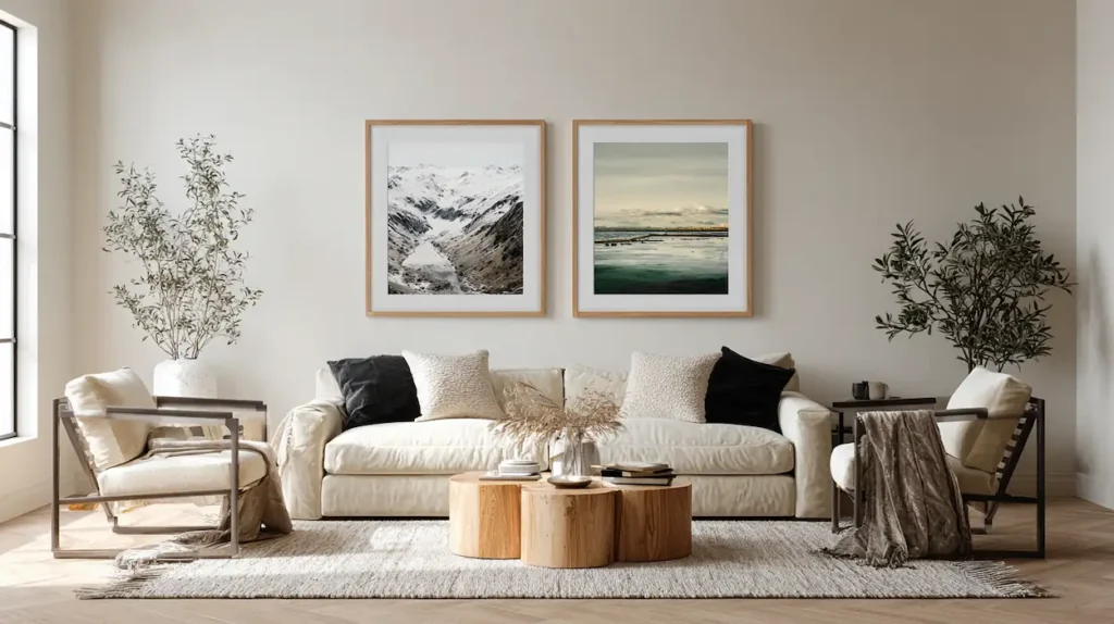
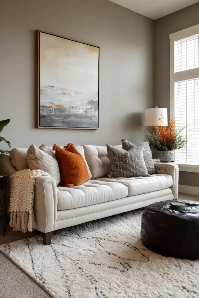
This size becomes a focal point. It holds space like art should — not as decoration, but as a statement. Placed above a sofa or console, it balances the room.
It gives your sofa or bed a visual center without shrinking into the background.
Best For
- ✦ Above sofas, beds, mantels
- ✦ Entryway statements
- ✦ Minimalist interiors needing one strong piece
- ✦ Spaces with high ceilings
Emotional Feel
16×20 declares: “This is the heart of the room.” It invites easy attention and anchors gatherings.
Compare Them Visually (Without Numbers)
| Feeling | 11×14 | 16×20 |
|---|---|---|
| Presence | Subtle | Bold |
| Space Anchor | Light | Strong |
| Best Pairing | Gallery clusters | Standalone statement |
| Emotional Tone | Intimate | Intentional |
| Works With | Small walls | Large walls |
The real difference isn’t the math — it’s how your eyes rest on the wall.
Pairing With Furniture — What Looks Better?
Above a Sofa
- 11×14: Needs multiples (e.g., 3 in a row) to feel complete.
- 16×20: A single piece often feels beautifully balanced.
On a Floating Shelf
- 11×14: Fits comfortably next to books and objects.
- 16×20: Works if shelf is wide and minimal.
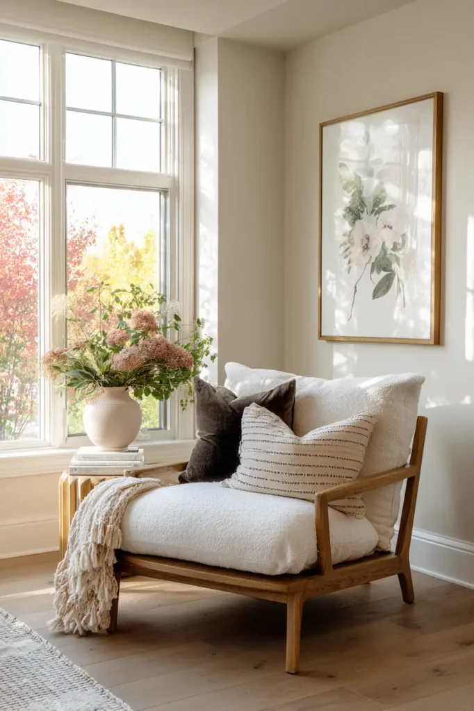
In a Reading Nook
- 11×14: Perfect companion to a cozy chair.
- 16×20: Could dwarf the space unless the nook is generous.
In a Hallway
- 11×14: Creates rhythm in repetition.
- 16×20: Turns a boring hallway into a gallery moment — but use sparingly.
How Distance Changes What You Perceive
Step back and notice what happens:
- Within 4–6 feet: You’ll feel the detail — smaller sizes let your eyes explore.
- Across the room (10–15 feet): Smaller sizes can disappear into the surface. Larger sizes keep you engaged.
This is why 16×20 often “feels better” in living spaces — it remains visible from every angle.
Light & Frame — Size Feels Bigger
Good framing and lighting can amplify size perception:
✔ Thin, light frames → keeps 11×14 airy
✔ Thick or dark frames → make 16×20 feel more grounded
✔ Directional light → gives depth and shadow play
✔ Wall color contrast → larger pieces pop most
The right context makes both sizes feel purposeful.
Situations Where 11×14 Looks Better
📍 Small apartment walls: Keeps space from feeling crowded
📍 Mixed gallery walls: Offers scalable rhythm
📍 Bedrooms & intimate spots: Comfort without dominance
📍 Collections & series: Coordinates with pattern & color
Why it works: You preserve breathing room. The wall feels curated, not crowded.
Situations Where 16×20 Looks Better
📍 Main living area: Speaks confidently
📍 Above long furniture: Gives scale & balance
📍 Minimalist spaces: One clear visual story
📍 High ceilings: Holds the vertical real estate
Why it works: You give purpose to the biggest empty surface in the room.
Practical Design Tips — What Actually Works
1. Start With Your Furniture
Stand back and measure in your mind:
- Your piece should be roughly two-thirds the width of what it sits over (sofa/console).
- If 11×14 can’t fill it visually, go 16×20 or multiples.
2. Think Vertical vs. Horizontal
- Portrait orientation can make ceilings feel taller.
- Landscape spreads horizontally, great above sofas and beds.
3. Use Templates First
Tape kraft paper to the wall in 11×14 & 16×20 shapes. Step away. Which feels aligned to the room?
4. Cluster with Intention
- 11×14 thrives in small groupings.
- 16×20 pairs well with one or two smaller companions rather than many.
5. Consider Sight Lines
From your doorway, which size pulls your eye? Higher impact works best.
Common Mistakes to Avoid
❌ Choosing size only by price or availability
❌ Ignoring furniture size and wall span
❌ Filling every wall with uniform sizes
❌ Using only small art in large, open spaces
Choosing the right size is about conversation with the space, not simply numbers.
Quick Size Guide (Visual Memory Aid)
- Think Cozy = 11×14
- Think Anchor = 16×20
- Think Gallery = Many 11x14s or Mixed
- Think Statement = One 16×20
This lets you decide feel before format.
FAQ
Does a bigger size always look better?
Not always. Bigger works if the wall and furniture need balance. Smaller works when you want intimacy.
Can I mix 11×14 and 16×20 together?
Yes — align them on a common baseline or in a curated grid for visual harmony.
What orientation should I choose?
Portrait feels elevating, landscape feels restful. Pick based on how you want the room to breathe.
Is frame style as important as size?
Absolutely — frame thickness and color can shift how large or small a piece feels.
Conclusion
When you’re torn between 11×14 vs 16×20, remember: it’s less about which is universally better and more about how you want the space to feel.
11×14 whispers. 16×20 speaks boldly.
Choose with the room’s rhythm in mind — and your walls will never feel silent again.