This Gallery Wall Frame Size Guide exists for one reason: to help you understand why some frame size combinations feel instantly right, while others never do.
A successful gallery wall is not about matching frames.
It’s about visual rhythm.
When sizes are mixed correctly, the wall feels wider, calmer, more intentional.
When they’re not, the eye gets tired — even if every piece is beautiful.
This guide shows:
- how a wall organizes itself visually without symmetry
- how to mix frame sizes without visual noise
- how to create a gallery wall people want to look at slowly
Each section below responds to a feeling you already recognize.
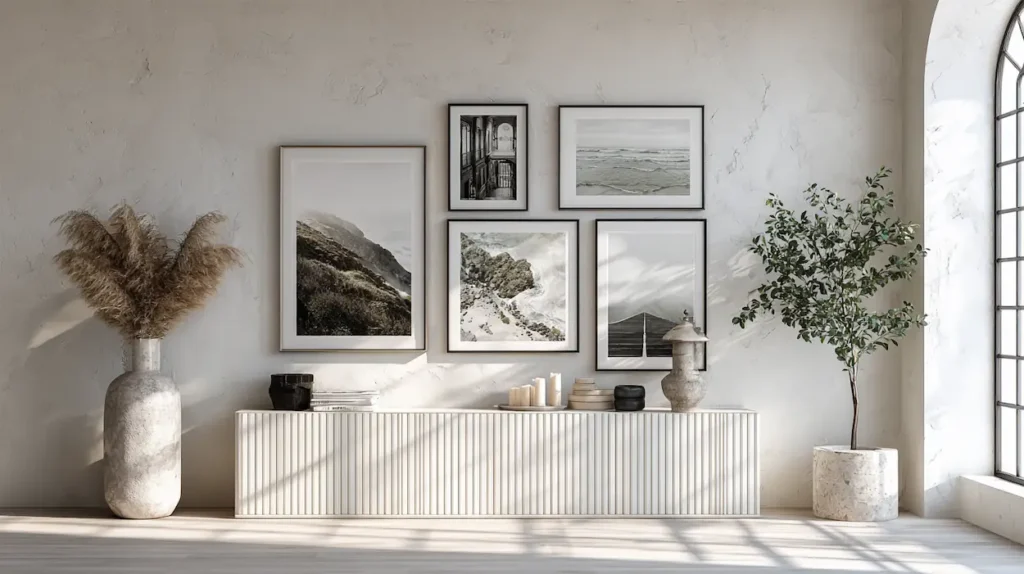
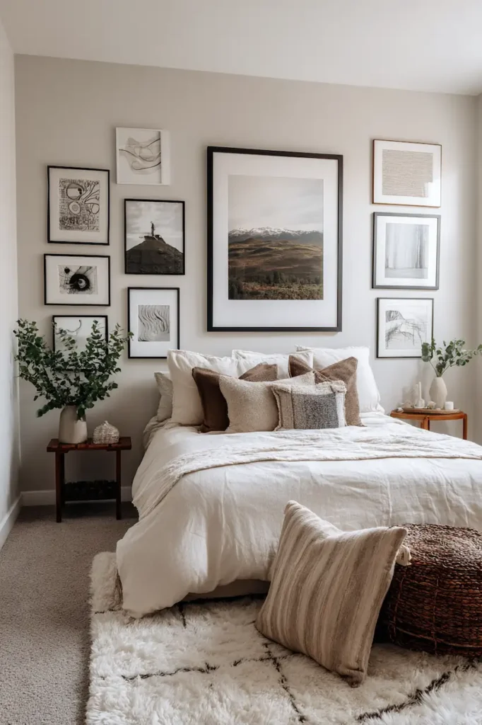
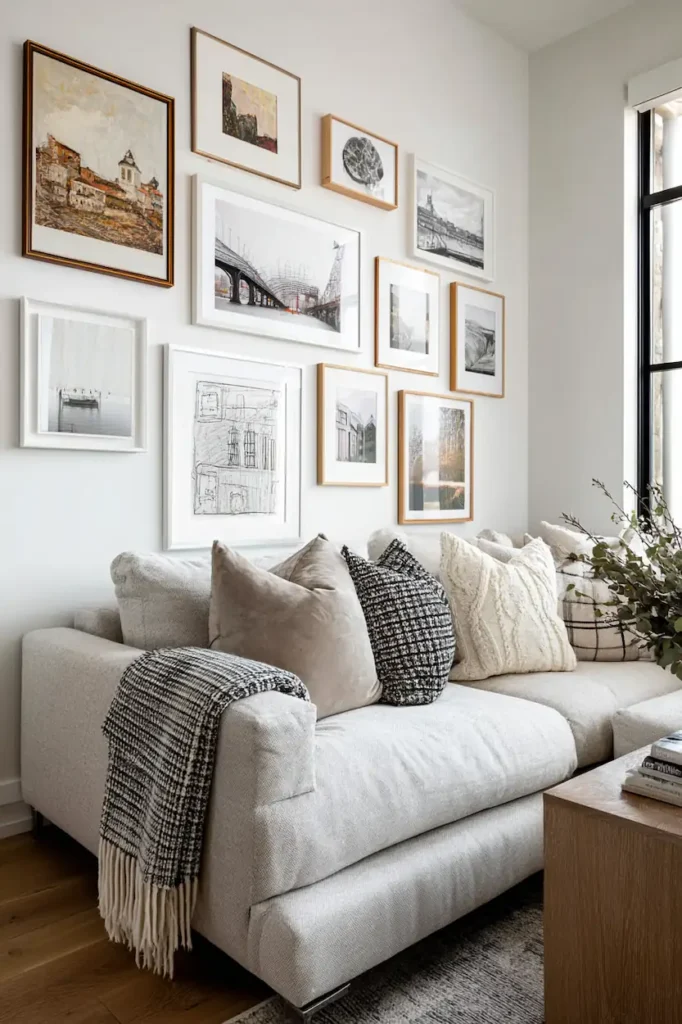
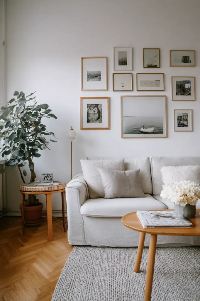
A balanced gallery wall always starts with one dominant frame size
A wall made only of medium or small frames feels flat.
There’s nothing for the eye to rest on.
The dominant frame works like a visual anchor:
- it grounds the composition
- it creates hierarchy
- it makes mixing sizes feel intentional
This frame doesn’t need to be centered.
It simply needs to be visually central.
In most gallery walls that feel right:
- one large (or strongly vertical) frame
- surrounded by secondary sizes
- completed with smaller accent formats
In this Gallery Wall Frame Size Guide, size hierarchy matters far more than symmetry.
Without a dominant size, the wall looks accidental.
With it, even asymmetry feels designed.
Medium frame sizes create visual continuity across the wall
Medium frames are often overlooked.
Yet they do most of the quiet work.
They:
- smooth visual transitions
- prevent harsh jumps between sizes
- guide the eye naturally across the wall
A wall made of one large piece and many small ones often feels unstable.
Medium sizes act as connective tissue.
They soften the composition, especially in calm, modern interiors.
They’re what make a gallery wall feel cohesive instead of busy.
Small frames are accents, never the foundation
Small frames attract attention.
Too much attention.
Used alone or in excess, they create:
- visual noise
- nervous energy
- a wall with nowhere for the eye to rest
Their role is clear:
👉 to accent, not to structure.
They work best when:
- grouped in pairs or trios
- placed near larger frames
- used as punctuation, not sentences
A simple test:
If removing all the small frames makes the wall collapse visually, they were doing the wrong job.
Mixing orientations matters as much as mixing sizes
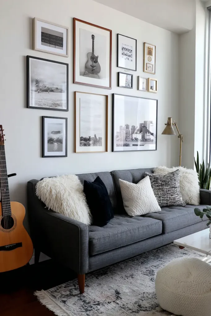
A wall made only of vertical or only horizontal frames feels stiff — even with great art.
Orientation creates:
- movement
- visual flow
- a sense of life
This isn’t math.
It’s perception.
When the eye can move up, sideways, pause, then continue,
the wall becomes an experience — not an arrangement.
A successful gallery wall reads like a composition, not a grid
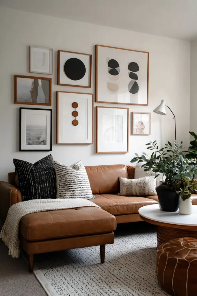
Walls that feel editorial are rarely built with a ruler.
They’re composed, not measured.
You don’t place frames one by one.
You observe:
- visual weight
- negative space
- breathing room
A strong gallery wall allows:
- imperfect alignments
- slightly varied spacing
- irregular rhythms
That’s what makes it feel human.
What Actually Works (And Why)
Practical rules that truly help when mixing frame sizes
1. Start on the floor, never on the wall
Lay everything out first.
You’ll instantly see imbalance, crowded zones, and missing anchors.
2. Use the 60 / 30 / 10 rule
- 60% medium sizes
- 30% one dominant large size
- 10% small accent frames
This ratio creates natural visual flow.
3. Keep frames visually consistent
Mix sizes, not chaos.
Same color or same material = readable wall.
4. Space by eye, not by measurement
Spacing should feel even, not be mathematically exact.
Common mistakes to avoid
- too many small frames
- no focal point
- overly rigid alignment
- mixing sizes, colors, and styles all at once
When frame sizes are clear in your mind, visualizing the layout becomes easier.
If you want to test proportions and spacing before hanging anything, this gallery wall planner helps you translate size logic into a real wall composition.
FAQ
Do all frames need to match in a gallery wall?
No. Sizes should vary. Coherence comes from rhythm, not uniformity.
How many frame sizes should I mix?
Ideally three to four. More than that becomes visually confusing.
Is it okay to mix portrait and landscape frames?
Yes. It’s essential to avoid stiffness.
Can a gallery wall work on a small wall?
Absolutely — if sizes are well-hierarchized and not overcrowded.
Conclusion
A successful gallery wall doesn’t need explanation.
You feel it.
When frame sizes are mixed well, the wall becomes quietly powerful.
It doesn’t try to impress — it balances the room.
If this Gallery Wall Frame Size Guide made you look at your wall differently,
it’s probably worth saving for later.